Tick by Tick 5
103
0
2024-01-09
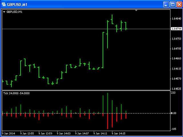
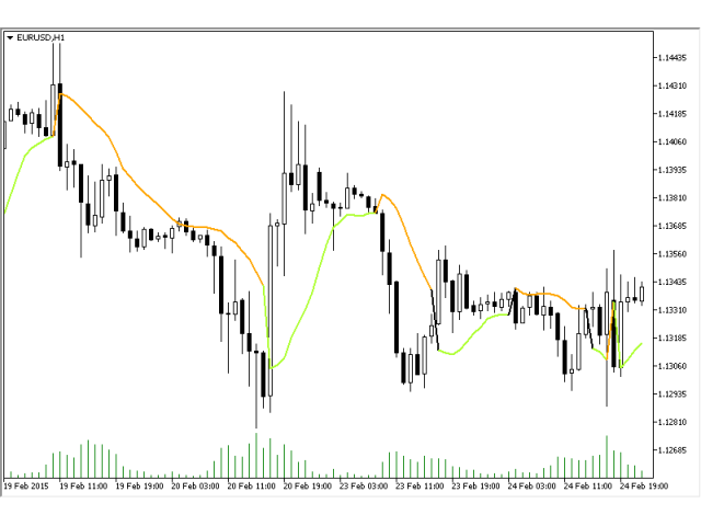
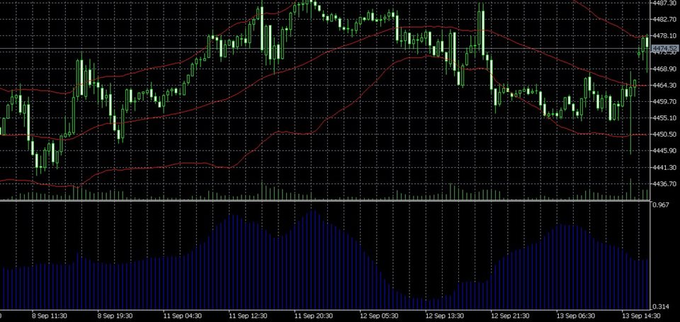
This indicator is designed for M1 timeframe and shows:Sum of points when the price goes up (Green Histogram).Sum of points when the price goes down (Red Histogram). In other words, by the number and ratio of bullish points to bearish ones, you c
This indicator is designed for M1 timeframe and shows:
Sum of points when the price goes up (Green Histogram).
Sum of points when the price goes down (Red Histogram).
In other words, by the number and ratio of bullish points to bearish ones, you can do a technical analysis of the state of the market.
If the green histogram prevails over the red one, you can conclude that at the moment the buyers are stronger than the sellers, and vice versa, if the red histogram prevails over the green, the sellers are stronger than the buyers.

 网络资源
网络资源